- Published on
A Beginner's Guide To Building Shareable React Components, Part 1: Theory
A solid plan leads to a solid foundation
- Authors
- Name
- Nate Geslin
- @n8rzz

Over the years, I have been lucky enough to be part of several projects where we built component libraries. Or built components that were shared across multiple projects. Most of these projects used React, some used Angular. The strategies behind planning shareable components is similar no matter the library or framework.
Planning components is possibly the most important part of building components. Making decisions up front about how to build something is extremely important. Frequently we make these decisions on the fly, it gets overlooked, and we dive right into building.
This is a mistake. It may be fast now, and it may feel like you’re saving time now.
You’re not.
It will cost you much more time in the future. Not planning is expensive.
Today we are going to talk about some of the things I like to do when planning components. These aren’t hard and fast rules, just things I’ve found success with.
It’s important to note, the output of this first phase is not code. The output of this work is a blueprint someone could use to build a component*.* In real life, this is the sort of work I would do when planning work for my team. I don’t always go this deep. I do when there are a lot of decisions to be made. Making some, not all, of those decisions up front helps development move efficiently.
Design
I’m not a designer. I like to think I have a good eye for things, but I couldn’t design my way out of a cardboard box. I’m an engineer. For the sake of this series, and with all that in mind, it may be helpful to reference the following design while you read.
 Card or Accordion component with Steve Zissou, from The Life Aquatic (https://www.fillmurray.com/375/375)
This is a silly design, I know. This component isn’t necessarily supposed to be useful in real life. Instead, its purpose is to provide something for us to design, build and test.
In a to-be-written-article we’ll go over how to break this down using the techniques I describe here.
Component Libraries
This series assumes the deliverables will be written from scratch. In real life, this may not always be the case. There are all kinds of component libraries out there and it is not uncommon for teams to use these. It can speed up the work. It can also slow down the work.
Thankfully, I’m not going to argue for or against component libraries today. Just know that they are a thing and, if a team is using them, may invalidate most of what you’re about to read.
Flexibility
If I had a dollar for every time requirements changed, I’d need a rather large piggy bank. Plan on requirements changing. Plan for your component to be able to easily respond to change. Or have a plan for supporting new requirements. It might surprise you that sometimes the best way forward is not to extend an existing component.
Throughout this process, you should always be thinking about flexibility. If requirements change, can your component adapt or will it need sweeping changes?
To be flexible or not?
Should your component be built to be flexible? Sometimes it does not make sense for a component to be flexible at all and instead should be very rigid. A component is going to solve one specific problem. In those cases, adding flexibility doesn’t make sense at all. Flexibility may actually make your component brittle.
That should be avoided.
Over time you’ll develop a feel for what sorts of components should be flexible and which ones should not be. Also, don’t spend too much time thinking about every little thing that could change in the future. At this phase it’s important to develop an opinion. What could happen next when and if requirements change? You don’t need much more than an opinion, so be careful to not get lost in the weeds here.
Boundaries
The absolute first thing I do when I start planning a new component is decide where the boundaries need to be. This is one of the most important things to consider early on.
What should this component care about? Does it have state? Does it need to care about events? How much layout should this component control?
These are things that must be decided on first before you can start sketching out API contracts.
Wait*.*
Decided may be a strong word here. Opinion. You should have an opinion on these things. We’re planning here and it’s still early. You may not have enough information to actually make good decisions. Designs may still be changing and so on.
Having an opinion will help to keep things moving forward and will provide the basis for some sketches later on.
Layout
After you formulate an opinion on boundaries, it’s time to decide how much this component cares about layout. Sometimes it make sense for a component to care quite a bit about layout. Other times not much at all.
In terms of layout, every component will fall somewhere between what I like to call Loose Boundaries and Rigid Requirements.
Loose Boundaries
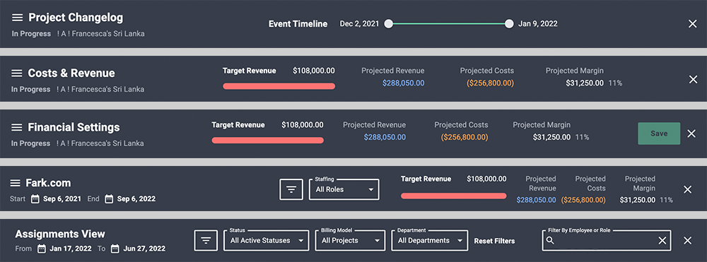
On one end is Loose Boundaries. This is a tough one to explain without a visual aid. At Parallax, we have a component called the UiActionHeader. This component is a great example of a component with loose boundaries.
 UiActionHeader
That looks like a lot of variation! One way to do this would be to code up each variant and, at implementation, tell the component which one you want.
Don’t do that. That’s way too much work, is confusing, and will eventually break. Instead, think about the loose boundaries that might exist here.
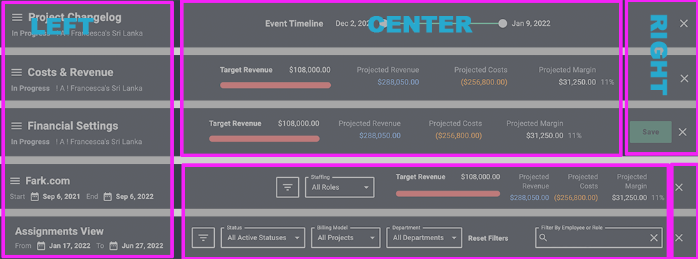
This component could be (is actually) broken up into three sections Left, Center, and Right.
 UiActionHeader sections Left, Center, and Right
These three sections are props and each optionally accepts JSX. We leave it up to the implementer to decide what should go in each section, if anything at all.
At the end of the day, the component itself is really quite simple. Its main responsibility is padding, basic layout, and a few minor props. By providing loose boundaries, we can create a component that is super easy to maintain. It’s consistent where we need it to be, like padding, but also provides wide flexibility where we need it. Leaving it up to the implementor to decide what could go in some pre-defined sections.
Rigid Requirements
The UiActionHeader above may have been a poor example. This is because that component is actually a bit of a hybrid.
What if a user did not provide any JSX? Well, there are a few required props for title and onClickClose. The title is specifically placed and will always be rendered, since it’s required.
This is an example of Rigid Requirements. An implementor must provide a prop, or props, and will always be rendered in a very specific way.
Component Internals
Props
It’s important to think about the data a component might need. We are, after all, planning a component that is going to be shareable. Also one that will, presumably, work within a system of existing components.
Does the data exist? Does the data require any transformations before it gets to the component? Does the data require any transformations after it gets to the component?
These are all things to consider when planning. This is one part of the exercise that will actually generate some artifacts. Here, you should rough out what the props might actually be.
{
  centerPortal: React.ReactNode;
  leftPortal: React.ReactNode;
  onClickClose: (event: React.MouseEvent) => void;
  rightPortal: React.ReactNode;
  title: string;
}
State
Should this component maintain its own state? Should state come from a parent? Is there state at all or is the component simply presentational?
A rule of thumb here is that if a component needs state, it might add complexity. I try to offload state to parent components when it makes sense.
Other times, though, it makes more sense to maintain state internally. One reason for that might be that nothing higher up the tree should care about a state property.
A good example of internal state might be a smart form element or an accordion.
Tests
We aren’t actually writing tests here. We are laying the groundwork for what those tests might cover, though.
Think in gherkin: Given, When, Then.
Writing out some form of gherkin kills two birds with one stone. First, it makes it pretty easy to communicate how a component should work. Second, it makes writing appropriate tests later on a little easier. The high level parts are already written down.
Gherkins are another artifact produced during planning. They don’t need to be perfect. Gherkin-ish is perfectly fine as long is it communicates clear requirements. Some thought here will go a long way towards making a smooth development phase.

Artifacts
You didn’t do all this work for nothing!
You’ve reached the end of this exercise and now you should have a few things to share with your team:
- Props
- State
- Expectations
- Assumptions and Questions
- Future Considerations
Sometimes I’ll also include a quick code example. I’ll only do this if I feel it will be helpful to prove a path forward. I talked about doing something similar in Use React and Feature Flags To Roll Out New UI Components.
A code example can help explain a complicated bit quickly. Be careful not to actually build the thing here, though. You need to allow the person building the component space to actually build the component! Pseudo code can go a long way here, just as long as it’s readable
Conclusion
You are now armed with the theory behind planning a sharable react component!
- Flexibility — How flexible should we be
- Boundaries — Where do our concerns start and stop
- Layout — Loose Boundaries or Rigid Requirements
- Component Internals — What data do we need and where does it come from
Soon I’ll be publishing Part 2 of this series where we’ll put these things to use and plan out our awesome-non-sensical-component. I hope you’ll follow along!